Sestava is an independent café in Prague built around the idea of bringing different people together. That became the starting point for the entire visual identity — playful, warm and inviting, but intentionally made up of different elements, personalities and colours.
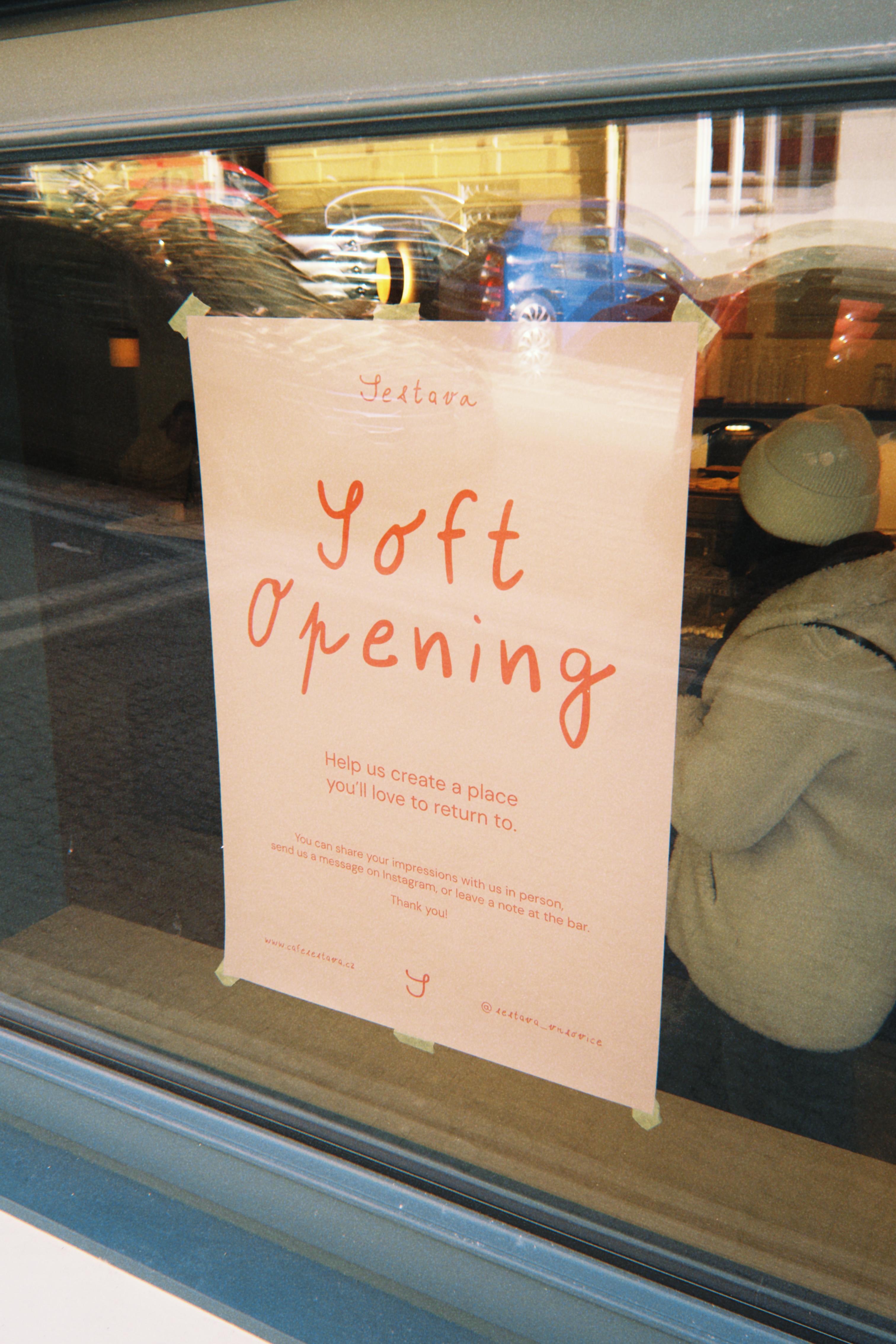
At the centre of the identity is a custom typeface created from the handwriting of the café’s six founders — five women and one man — combining their individual styles into one shared visual voice. This idea of assembling different parts into a coherent whole then carried through the wider brand system, from the colour palette and typography to menus, signage, packaging, loyalty cards and digital communication.
The result is a characterful and flexible identity that feels personal, slightly imperfect and distinctly Sestava.
Sestava is an independent café in Prague built around the idea of bringing different people together. That became the starting point for the entire visual identity — playful, warm and inviting, but intentionally made up of different elements, personalities and colours.
At the centre of the identity is a custom typeface created from the handwriting of the café’s six founders — five women and one man — combining their individual styles into one shared visual voice. This idea of assembling different parts into a coherent whole then carried through the wider brand system, from the colour palette and typography to menus, signage, packaging, loyalty cards and digital communication.
The result is a characterful and flexible identity that feels personal, slightly imperfect and distinctly Sestava.
Sestava is an independent café in Prague built around the idea of bringing different people together. That became the starting point for the entire visual identity — playful, warm and inviting, but intentionally made up of different elements, personalities and colours.
At the centre of the identity is a custom typeface created from the handwriting of the café’s six founders — five women and one man — combining their individual styles into one shared visual voice. This idea of assembling different parts into a coherent whole then carried through the wider brand system, from the colour palette and typography to menus, signage, packaging, loyalty cards and digital communication.
The result is a characterful and flexible identity that feels personal, slightly imperfect and distinctly Sestava.